That we humans are different is nothing new. The same applies to how we take in information and knowledge, where some of us prefer visual and auditory learning while others prefer to read themselves to the same knowledge. Likewise, our preferences vary when it comes to the approach to learning. Some people prefer a formal, timed training session, and others prefer more informal learning where the person decides the schedule themselves.
There are several aspects to consider when knowledge is to be shared within an organization. Many organizations experience a challenge in conveying information in a way that is easy to understand and absorb for all employees.
A guiding star in the creation of training and instructional materials is the winged expression "less is more" to reduce the amount of information included in the material and instead focus on the more comprehensive. Humans have a limited ability to concentrate, and with too much information, there is a risk that relevant facts are missed or forgotten. Another successful method is to offer varied learning styles to meet individual preferences.
To increase motivation and promote learning, organizations can benefit from interactivity in their digital training. By using videos, text sections, and FAQs, participants can actively engage with the content. It is important to remember that many people have difficulty maintaining focus for long periods of reading or viewing, making it necessary to create a variety that maintains their interest and engagement.
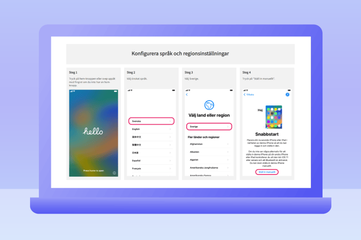
The IT technician Sofie Johansson at Skövde municipality realized the importance of variety when she created the training guide "Installation of new service telephone" for the municipality's employees. She goes on to say:
When I'm not making guides, I work in the IT emergency room, which can be seen as a physical Service Desk. The majority of cases we handle are phone-related cases.
The idea with the guide was to try to collect everything we usually help with within a single guide but at the same time not make it too powerful to absorb. Too long texts and too few pictures are something that, in any case, makes my brain shut down. I know that I myself learn better by watching a video, but sometimes I might be stuck on a small step, and then text/pictures might be enough to move on quickly. The other settings I have chosen to put in a FAQ menu help not to make the guide too long, and it becomes easy to choose which sections you want to look at further. It will also be a win for our Service Desk, which can help users over the phone more efficiently if they are stuck at any step.
 Click here to get to Skövde Municipality's education guide (in Swedish)
Skövde municipality receives the Guide of the Month award
Every month we at InfoCaption appoint the Guide of the Month - a guide we want to highlight a little extra because of its value in the organization. As a thank you to the person(s) who created the Guide of the Month, we donate SEK 1,000 monthly to the organization Hand in Hand Sweden, which fights poverty by creating more jobs in vulnerable countries. Hand in Hand works with the "help to self-help" model, which aligns with InfoCaption's mission "to make it easier for employees to help each other."
We at InfoCaption see Skövde Municipality's guide as an excellent example of an educational guide with a broad scope that has the potential to reach many people, regardless of preferences in terms of knowledge acquisition. The fact that the guide is also available for both Samsung and iPhone makes the range of use even wider!
Do you want to learn more about how you can share knowledge in a better way?

